Insights
Stats view
Stats view is the third view alongside the board and Table view. It gives you a snapshot of your whole job search: headline numbers, how many applications you send each week, where your jobs sit right now, and how long they spend in each stage.
Switching to Stats view
Use the view toggle in the toolbar to switch between Board, Table, and Stats (the option with the bar-chart icon). Trackur remembers your choice, so if you close the app on Stats you reopen on Stats. On a phone, the toggle lives in the ... overflow menu under View — see Trackur on mobile.
While Stats is active, the search box, stage filter, due pill, and archive toggle disappear from the toolbar — they don't apply here. Only the view toggle, export, import, and Add Job remain.
Stats cover everything
Stats are always computed over every job in your account, including archived jobs. Search and filters never narrow the numbers. The one exception is the Active pipeline tile, which excludes archived jobs.
If you have no jobs yet, Stats view simply reads "Add jobs to see stats."
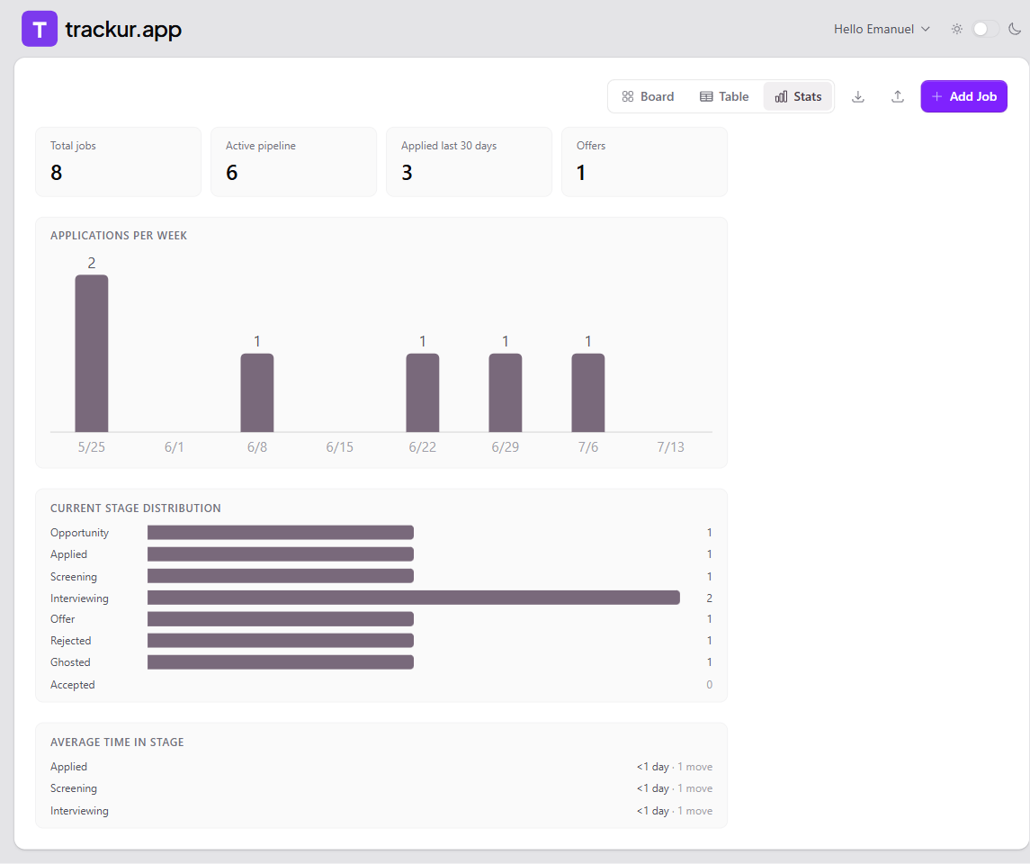
The four tiles
A row of tiles at the top summarizes your search — four across on desktop, two across on mobile.
| Tile | What it counts |
|---|---|
| Total jobs | Every job in your account, archived included. |
| Active pipeline | Non-archived jobs currently in Opportunity, Applied, Screening, Interviewing, or Offer. |
| Applied last 30 days | Jobs whose Date Applied falls within the last 30 days. |
| Offers | Jobs currently in the Offer or Accepted stage. |
Offers reflects the current stage only — a job that had an offer but was later moved to Rejected doesn't count. Applied last 30 days only counts jobs with a Date Applied set.
Applications per week
The Applications per week chart shows the last 8 calendar weeks as bars. Weeks start on Monday, and each bar is labeled with its week's start date (for example, 7/6). Every non-zero bar shows its count above it, and hovering a bar shows a tooltip like "Week of 7/6: 3".
The chart buckets each job by its Date Applied field — not the day you added the job to Trackur. Applications older than 8 weeks fall off the left edge of the chart.
No Date Applied, no bar
Jobs without a Date Applied are invisible to this chart and to the Applied last 30 days tile. You can set the date on the card or in the Edit panel — see Editing jobs.
Current stage distribution
The Current stage distribution chart shows one row per stage — all eight, from Opportunity to Accepted — with a horizontal bar sized relative to your largest stage and the count at the right of each row. Stages with no jobs show a dimmed 0 and no bar.
This chart reflects where jobs are now, not where they've been, and it includes archived jobs.
Average time in stage
The Average time in stage section lists, for each stage, the average number of days jobs spent there before moving on — for example, 12.5 days · 4 moves. Stays shorter than a day show as "<1 day".
The numbers come from your jobs' automatic stage history: for each job, the time between entering a stage and leaving it. Only completed stays count — time a job is still sitting in its current stage isn't included, so averages can look low early in your search. A stage appears in the list only once at least one job has left it.
If you have jobs but none has ever changed stage, the section reads "Appears as jobs move between stages."